Why Visitors Quickly Leave a Streamer's Landing Page
A Short Visit Doesn't Always Mean a Bad Page
A visitor may open a streamer's site, see the schedule of the next broadcast, click the Twitch, Kick, YouTube button or a community link, and immediately close the tab. For a hub page, this is a normal path: the site fulfilled its function in a few seconds. Pages with a single action work the same way — for example, signing up for a private stream, buying merch, or joining Discord.
The problem arises when a person doesn't reach the right block, doesn't click the main button, and doesn't go to the channel, even though that was the page's goal. Don't judge the situation by visit time alone. Compare the referral source, link clicks, scroll depth, schedule views, video plays, form submissions, and outbound transitions.
Metrics for a Streamer's Landing Page Should Be Read by Scenario
For a page with links to platforms, low scroll depth may be normal: the user saw the needed button at the top and left for the broadcast. For a promotion services page, team recruitment, selling integrations, or subscription sign-up, the picture is different. Here, a quick exit before the terms block usually means the visitor didn't understand the offer or lost interest too early.
It's useful to set working thresholds for your own funnel rather than looking for a universal "norm." For example, if fewer than half of visitors scroll the landing page to the placement formats block, it's worth checking the first screen and content order. If almost no one reaches the form or contacts, the problem may be in an overloaded structure rather than the form itself.
For mobile traffic, the first signal will be when useful content appears. The headline, description, and main button should ideally be shown within roughly the first two seconds after opening on a typical mobile connection. This isn't a guarantee of retention but a practical guideline: if instead of the offer you see a background, preloader, or empty block for a long time, the page loses before the visitor even meets the offer.
Irrelevant Traffic Brings People with the Wrong Task
A transition from a video, Telegram post, community ad, or search results should lead to a page that continues the source's promise. If a post announces recruitment of viewers for a specific event, but the link opens the main page with a general description of the team, the person won't search for the right section through the menu. They'll return to the feed or search results.
Check traffic from each platform separately. Audiences from short videos, viewers from a live stream, ad transitions, and people from search arrive with different levels of interest. Quick exits from just one ad campaign don't mean the whole site needs to be redone. First, compare the creative, link text, ad audience, and landing page.
A broad campaign has a drawback: it can bring many transitions from people who don't need the service or content. Narrowing the audience reduces reach but helps bring visitors to the landing page with clear motivation.
The First Screen Should Explain the Offer Without Scrolling
On the first screen, the visitor should immediately see whose site this is, what's being offered, and what action is available next. For a streamer's page, this could be the next broadcast, the platform, and a transition button. For an agency or promotion service — a specific service: placement with streamers, launch support, external traffic work, integration selection, or channel design.
The first screen confirms the reason for the visit rather than introducing the project's history. The phrase from the ad should continue in the landing page headline. If the user clicked "promoting a broadcast before launch," don't make them first read about the team's values, look at a collage of games, and search for the service further down the page.
First Screen Checklist
- The headline names the service, broadcast, or event without vague wording.
- Below the headline there's an explanation: who the offer is for and what it includes.
- The main button leads to one clear action rather than opening a set of random links.
- The button is visible on a smartphone without scrolling and isn't covered by a consent banner or chat.
- Background video, animation, and cover don't hide the text or delay its appearance.
- The screen doesn't have several equally important calls to action: "Subscribe," "Order," "Open chat," "Watch clip," and "Write" all at once.
Speed Matters Until the First Useful Block Appears
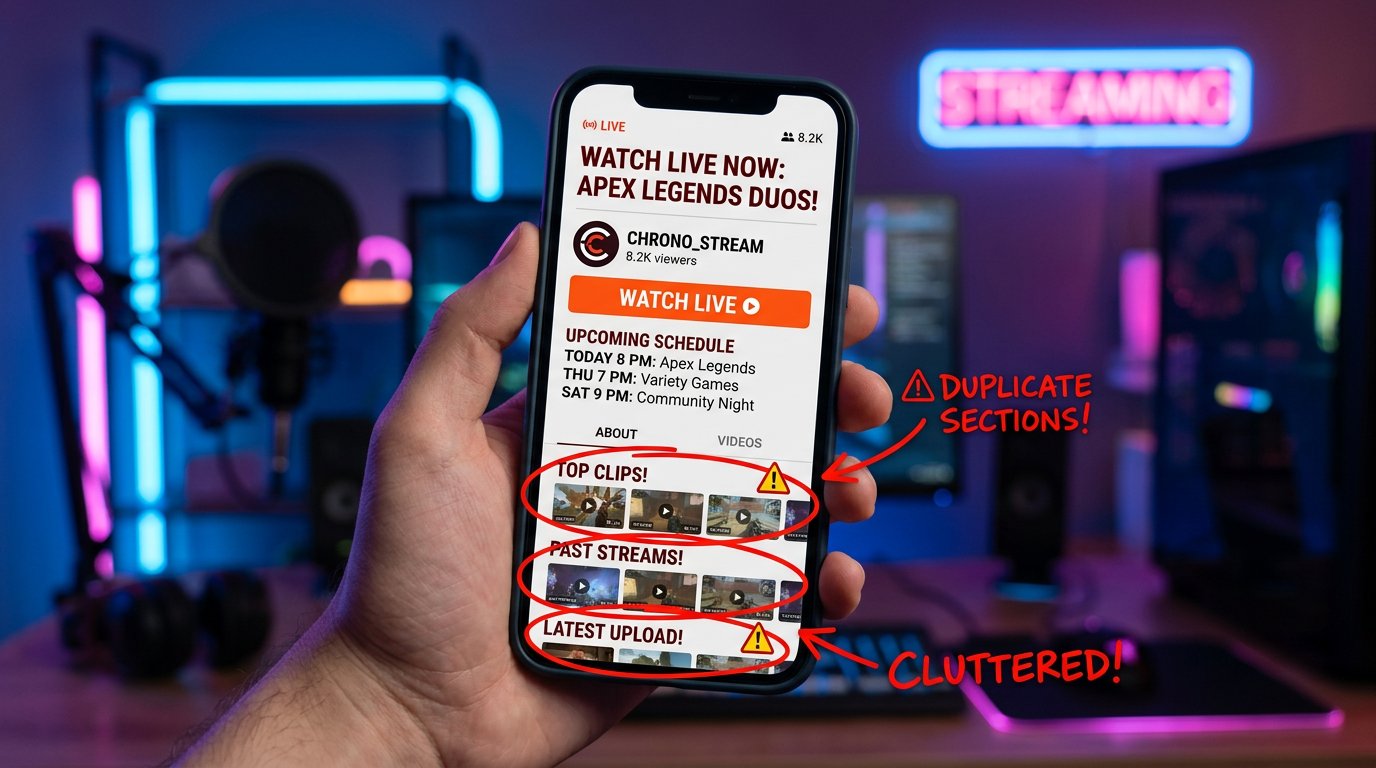
Streamer landing pages are often overloaded with elements meant to create atmosphere: a video background with highlights, heavy animation, embedded chat, a player, a clip feed, widgets from several social networks. On desktop, such a set can look impressive. On a phone, it delays the headline, consumes traffic, and makes the interface jump during loading.
Check more than just the final score in performance services. Open the site from a phone or in a weak-connection emulation and time the moment when you can read the offer and click the button. Separately check the page after arriving from a social network's in-app browser: players, authorization, redirects, and heavy scripts may work differently there.
Replace the decorative video background with a static cover, defer loading of secondary widgets, and don't put several embedded streams on one screen. Such simplification has a drawback: the landing page may lose some visual proof that the channel is alive and active. So keep clips, stream recordings, and screenshots where they help make a decision rather than just take up space.
The Page Structure Shouldn't Force People to Search for the Main Point
A menu doesn't replace a sequential scenario. The visitor isn't obligated to open the "About Us," "Services," "Cases," and "Contacts" sections to assemble the offer piece by piece. On a promotion page, it's better to show the logic right in the feed: what's being promoted, which platforms the work covers, what materials are needed from the channel, how approval works, and where to send the request.
On the streamer's own page, the order is different: the next broadcast, links to main platforms, schedule, content format, community rules, support methods, and contacts for integrations. Don't mix these tasks into one first block. A viewer, an advertiser, and a potential team member are looking for different information.
A long page has a drawback: some people won't read it to the end. But a short landing page without terms, examples, and explanations looks incomplete. Put the main points higher, merge repeating blocks, and use subheadings that make the page easy to scan.
The Text Should Speak the Language of the Channel's Task
Phrases like "quality promotion," "unique approach," and "effective solutions" don't explain what the channel owner will get. For someone preparing a new format, a seasonal launch, or a major broadcast, it's more important to understand the scope of work: landing page preparation, announcement placement, setting up transitions, designing materials, collecting statistics on ad links.
Describe limitations as directly as opportunities. Promotion doesn't replace an interesting broadcast, a regular schedule, a clear format, and audience engagement. You can't promise steady growth in viewers or subscribers, because the result depends on the broadcast topic, platform algorithms, competition for attention, and the quality of the content itself.
Specific terms retain better than loud promises. State what will be required from the client, which links and creatives are needed, how placements are approved, and in what form reporting is delivered. Such text filters out some random requests but reduces visits without understanding of the service.
Distrust Is Especially Noticeable in Services for Streamers
Channel owners are cautious about offers that promise activity, views, or audience without explaining the source. If the site hides how it works, doesn't show contacts, leads to empty profiles, or uses outdated screenshots, the visitor may close the page before even studying the terms. Broken links to channels and cases without context look especially bad.
Add real examples: a description of the task, the formats used, campaign limitations, and available placement confirmations. Don't claim others' results and don't publish channel data without permission. Cases have a drawback: they quickly become outdated if the stream format, platform, or promotion terms have changed. Materials need to be reviewed regularly.
For a streamer's page, trust is built by an up-to-date schedule, working links, clear advertising contacts, and community rules. If broadcasts haven't aired for a long time but the landing page shows an old schedule, the visitor may conclude the channel is abandoned.
Popups, Sound, and Widgets Can Cover the Content
Autoplay video with sound, a pop-up subscription form, and a chat widget in the first seconds create unnecessary friction. On a streamer's site, it's especially easy to overdo it: you want to immediately show the trailer, the latest clip, an online player, Discord, donations, and a subscription notification. On a mobile screen, these elements can completely cover the main text.
Show an additional offer after a user action: scrolling to a certain block, viewing a case, clicking the schedule, or attempting to leave the page. This approach has a drawback: some of the audience won't see the popup. But the visitor will first understand where they've landed and won't perceive the site as a set of obstacles.
Check separately the cookie notice, the chat close button, banners, and bottom panels. If an element can't be closed with a finger or reappears after closing, it will collect quick exits regardless of content quality.
The Form and External Links Shouldn't Break the User's Path
A promotion request form shouldn't require a full media kit, links to all accounts, budget, technical brief, and detailed channel history at the first step. Enough data to start a conversation and clarify the task later. An integration request may need more information, but explain why each required field is needed.
A too-short form also has a drawback: more incomplete inquiries will come in, and time will be spent on clarifications. Split the scenario into steps or add a goal selection: broadcast promotion, channel design, advertising integration, other collaboration. Then the visitor will see relevant fields instead of a long universal questionnaire.
Check all external transitions manually: buttons to streaming platforms, community invitations, messengers, payment forms, and links from QR codes. On a phone, the keyboard shouldn't cover the submit button, and a link shouldn't lead to a deleted channel, an error page, or an inappropriate regional section of the platform.
How to Find the Cause of Quick Exits in Analytics
Don't look at the average value across the whole site. Compare specific landing pages, sources, device types, and new visits. Separately study the behavior of users who came to the broadcast page, the services page, the page for advertisers, and the hub with links. These scenarios have different target actions, so one metric won't show the full picture.
- Compare the text of the ad, post, or video with the landing page headline.
- Check how long it takes for the headline and main button to appear on a mobile screen.
- Set up events for clicks on platforms, schedule, form, messengers, and support buttons.
- Look at scroll depth to key blocks: terms, cases, contacts, and the form.
- Open session recordings and click maps to find overlaps, false taps, and hanging elements.
- Check the page at different network qualities and in social networks' in-app browsers.
Changes Should Be Tested One Scenario at a Time
Don't change the headline, design, form, ad creative, and widget set all at once. If visitor behavior changes, it will be impossible to determine the cause. Start with the obvious: broken links, slow appearance of the first screen, a mismatch between the ad and the landing page, an overloaded mobile version.
Then test one element at a time: the offer wording, block order, main button text, cover size, popup timing. Compare not only session duration but also useful actions. A visitor may spend less time on the page after an improvement because they found the broadcast link faster or submitted a request. For a streamer's site, this is often a good result.
Last Articles
What has changed in design and functionality We have updated the website to make working with it faster and more convenient. The main changes affect ..
Good afternoon, I've collected all the news during this time.: 1. The main news is that prices for twitch viewers have been greatly reduced, while Tw..
1. Use promo code "December2025" for a 15% discount for all our viewers2. We have reduced the base prices for our configurator and the most affordable..
Twitch services are working stably, so we are ready to cooperate with squads, resellers, service owners, bot owners, and many others.Individual te..
We have completely updated our Twitch viewer services, and they are now working stably. We only use high-quality IP addresses for the viewers.The ..
Hello everyone! Today, we are announcing a new feature—"Twitch Viewer Configurator". Now, you can customize any plan for your Twitch channel. Choo..
Greetings, I have compiled a guide for streamers, which will be very relevant at the moment. Now YouTube and twitch have disabled monetization from vi..
We have finally developed the APINow it will be more convenient for our partner sites to work with us.To update the maximum tariffs for YouTube, an up..
Due to the huge popularity of the partnership services and referral program, we have made a cooperation table. The essence is very simple: more live a..
Our Services for Streamers





Our Services for Content Creators