Blurry VKontakte video thumbnail: causes and file setup
Why the thumbnail loses sharpness right after upload
The file on your computer and the thumbnail in the VKontakte interface are not the same image. After upload, the platform prepares reduced versions for the feed, video grid, recommendations, search, community page, and mobile app. Each version is scaled and compressed for a specific block. That's why a crisp layout from your editor can become soft, grainy, or soapy right in the video card.
The problem is more noticeable on small text, thin lines, faces, hair, game interfaces, and high-contrast details. The source file isn't necessarily damaged: quality loss happens along the chain of export, upload, processing, and display. You need to check the thumbnail at the actual size of the card, not on the editor canvas.
What size and proportions to choose for the thumbnail
For horizontal video, prepare a thumbnail in a 16:9 ratio. The working size is 1280 × 720 pixels. It provides enough detail for processing and doesn't require artificially stretching a small frame. You can build the layout at 1920 × 1080 pixels if the source frame is high quality and your editor doesn't lag on large files.
Don't make a horizontal thumbnail from a vertical screenshot without separate composition. When stretched, such a frame loses detail, and when cropped, it's easy to lose a face, character, or important interface element. The downside of the 16:9 format is that vertical sources have to be reassembled: add a background, change the cropping, or find another still frame.
Why a small source can't be fixed by exporting
A 640 × 360 pixel frame can be enlarged to 1280 × 720, but no new details will appear in it. The editor will only interpolate intermediate pixels. After processing by the platform, this often turns into fuzzy edges, uneven letters, and blotches on the face. Old screenshots, images from messengers, and frames cut from already published videos behave especially badly.
Take a still frame from the original recording, not from a player or someone else's post. If there's no suitable frame, it's better to make a simpler design on a clean background. The downside of this solution is obvious: the thumbnail will be less tied to a specific stream scene, but it will stay readable after shrinking.
Where VKontakte shrinks the thumbnail the most
The same image looks different on the video page itself and in compact blocks. In a large card, you can see texture, facial emotion, and object details. In the feed, search, or video grid, they can blend into the overall background. This doesn't always mean the upload went badly: the platform is showing a different reduced copy of the same file.
The author can't prepare a separate image for each block. That's why the composition is built with margin: one main object, short text, and free space around them. The downside of this approach is less room for game details, logos, secondary characters, and decorative effects.
How to check the thumbnail at the actual card size
Don't rely on viewing the file in the editor at 100% zoom. On a monitor, this mode can show the thumbnail much larger than a viewer will see it in the feed. First export the layout, then shrink a copy to the width of the card you see in the VKontakte interface and check whether the text is readable without zooming in.
- Upload the thumbnail to the video and open the video page in a browser at 100% page zoom.
- Look at the preview in the feed, in the community's video section, and in the video grid on the channel page.
- Open the same places from your phone: the mobile card may be narrower or wider relative to the screen.
- If you need the exact block size on a computer, open your browser's developer tools and select the video card. The browser will show its width and height in pixels.
- Create a copy of the thumbnail in the editor at the same dimensions and evaluate the text, face, and main object.
Card sizes can change depending on window width, block type, and device, so there's no single number for all previews. The downside of checking via a published video is that it takes time and doesn't show the result before upload. But this way you see exactly what the viewer gets.
What font size survives shrinking
For text on a 1280 × 720 canvas, don't use a font size smaller than 60 pixels. This is the lower limit for a short caption of a few large words. For a headline that must be readable in the feed, it's safer to start at 72–96 pixels. The longer the phrase, the higher the risk that you'll have to shrink the letters to an unreadable size.
On a 1920 × 1080 canvas, increase the font size proportionally: at minimum around 90 pixels, and for the main phrase — from 108 pixels. This isn't a VKontakte requirement but a practical guideline for reduced cards. The downside of large typography is that it takes up a noticeable part of the frame and can cover an important game scene.
Why text turns into mush
Thin fonts, narrow letters, long phrases, and weak contrast are the first to go. After compression, the gaps between strokes shrink, thin lines merge, and outlines turn into dirty edges. White text on a bright sky, colored lettering on a game interface, or neon letters on a busy background look unreadable even with a good source file.
Leave one short idea on the thumbnail: the game name, stream format, event, or the main conflict of the video. To separate letters from the background, it's better to use local darkening, a colored plate, or a calm area of the frame. The downside of a plate is that it can make the design look templated and hide part of the image.
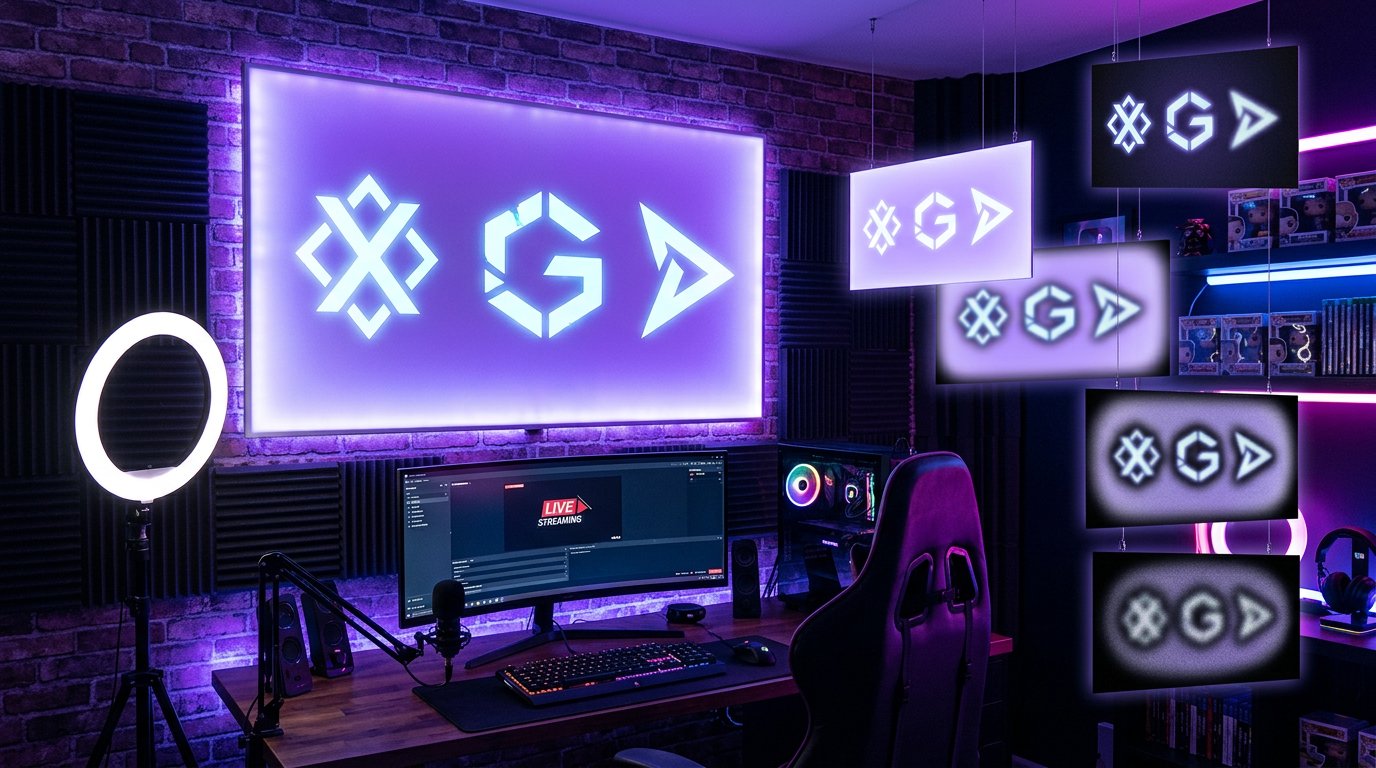
Why outlines and sharpening don't always help
A strong outline, shadow, and maximum sharpening seem like a quick fix, but after processing they often make the image worse. Light or dark halos appear on letters, harsh contours on the face, and noise on solid backgrounds. In a reduced card, these defects are perceived as over-compression rather than extra clarity.
Add sharpening only after final cropping, text placement, and image resizing. You should enhance the eyes, face, a large object, or a silhouette, not the entire frame. Sharpening won't bring back details that aren't in the source. The downside of moderate processing is that at full size the thumbnail may look less aggressive than competitors with over-sharpened designs.
Repeated saves amplify artifacts
An image often loses quality before it even reaches VKontakte. It gets saved as a screenshot, sent through a messenger, downloaded back, edited in a browser, and exported again. Each of these steps can add compression blocks, color blotches, and blurry transitions. After upload, these defects become more noticeable on dark backgrounds, smoke, grass, water, and gradients.
Work with the source from the editor or with the original frame from the recording. Don't use an image for the final thumbnail that has already been published on a social network or downloaded from one. The downside of this order is that you need to store source files, fonts, and the project separately. But when replacing text or fixing a mistake, you won't have to edit an already over-compressed copy.
A complex background can look like technical blur
Sometimes the file stays sharp, but the thumbnail itself is perceived as muddy. This happens when leaves, interface parts, a crowd, inventory, effects, sparks, small objects, and similar shades merge in a small card. The eye doesn't know where to look, and the viewer calls such an image blurry, even though the problem isn't in the export quality.
Simplify the area behind the text or main object: darken it, reduce the contrast of secondary details, choose another frame, or separate the character from the background. You don't have to apply artificial blur. The downside of simplification is that you can lose the game's atmosphere, the scale of the scene, or a recognizable location.
Gradients, smoke, and dark scenes survive compression worse
Smooth color transitions are sensitive to processing. On night scenes, in smoke, fog, sky, and darkened backgrounds, bands, blotches, and grain can appear. Visually this gives a feeling of overall soapiness, even though large text and the character stay in place. A similar problem occurs with bright neon on an almost black background.
Dark styling isn't forbidden, but it needs large shapes and clear contrast. Instead of several similar shades, it's better to leave distinguishable planes: background, character, accent object, and text. The downside of a smoother background is that at full size it may look simpler and less cinematic.
A safe zone protects important elements from cropping
Don't place the face, logo, and text right against the edges of the 1280 × 720 canvas. In some blocks, the image may be displayed with different cropping, and part of the side zone will become less noticeable. Keep the main object closer to the central area and leave free space around it. This is especially important for single-line captions and characters standing at the edge of the frame.
A central composition handles different display locations better, but it has a downside: many thumbnails start to look alike. To preserve the design's character, you can shift background elements toward the edges without moving text and the key object there.
What to check after uploading a new thumbnail
After replacing the image, some sections or devices may show a different version than you expect for a while. Don't upload several variants in a row and don't boost sharpening at random. First refresh the page, open the video in another browser or on another device, and compare the thumbnail with the source file.
- Check whether the file matches the 16:9 format and the size of 1280 × 720 or 1920 × 1080 pixels.
- Make sure the main text is set no smaller than 60 pixels on a 1280 × 720 canvas.
- Look at the video card on the video page, in the feed, and in the community grid.
- Evaluate the thumbnail from your phone without zooming the screen.
- Compare the text, face, and object edges with the version before upload.
- Check whether an over-compressed copy was used instead of the original image.
The downside of such a check is that it takes time before and after publishing. But without it, it's hard to tell whether the file itself is soapy, the composition is unsuccessful, or the problem is visible only in one preview variant.
A working scheme for preparing a VKontakte video thumbnail
- Choose a high-quality frame from the original recording or create an image from scratch.
- Build the layout at 1280 × 720 pixels while keeping the 16:9 ratio.
- Place the key object and text in the central part, without pressing them against the edges.
- Use a short caption with a font size of at least 60 pixels, and make the main headline larger.
- Remove small details from the background that prevent the main thing from being seen in a small card.
- Export the final file once and don't re-save it through messengers or social networks.
- After upload, check the thumbnail in the feed, video grid, video page, and on your phone.
Such preparation doesn't cancel processing on the platform side, but it reduces the risk that it will ruin the perception of the thumbnail. The most stable are a large object, short typography, a clean background, and details that remain clear after shrinking.
Last Articles
What has changed in design and functionality We have updated the website to make working with it faster and more convenient. The main changes affect ..
Good afternoon, I've collected all the news during this time.: 1. The main news is that prices for twitch viewers have been greatly reduced, while Tw..
1. Use promo code "December2025" for a 15% discount for all our viewers2. We have reduced the base prices for our configurator and the most affordable..
Twitch services are working stably, so we are ready to cooperate with squads, resellers, service owners, bot owners, and many others.Individual te..
We have completely updated our Twitch viewer services, and they are now working stably. We only use high-quality IP addresses for the viewers.The ..
Hello everyone! Today, we are announcing a new feature—"Twitch Viewer Configurator". Now, you can customize any plan for your Twitch channel. Choo..
Greetings, I have compiled a guide for streamers, which will be very relevant at the moment. Now YouTube and twitch have disabled monetization from vi..
We have finally developed the APINow it will be more convenient for our partner sites to work with us.To update the maximum tariffs for YouTube, an up..
Due to the huge popularity of the partnership services and referral program, we have made a cooperation table. The essence is very simple: more live a..
Our Services for Streamers








Our Services for Content Creators